Phi Data Analytics
Phi data Analytics is a Business Intelligence tool that ingests business data and presents it in user-friendly views such as reports, dashboards, charts and graphs.

Overview
Phi is a tool designed to help modern business intelligence teams work more efficiently. It gathers data from different sources, connects the data, defines relationships between pieces of data, and allows users to modify tables. With Phi, you can also create beautiful business reports, all within one easy-to-use platform.
The Problem
Our client's current product is difficult to use and inefficient. Users find it hard to navigate through the product and get desire output, which slows down their work and creates confusion. The system doesn't meet modern standards or the needs of its users, causing frustration and inefficiency.
Process
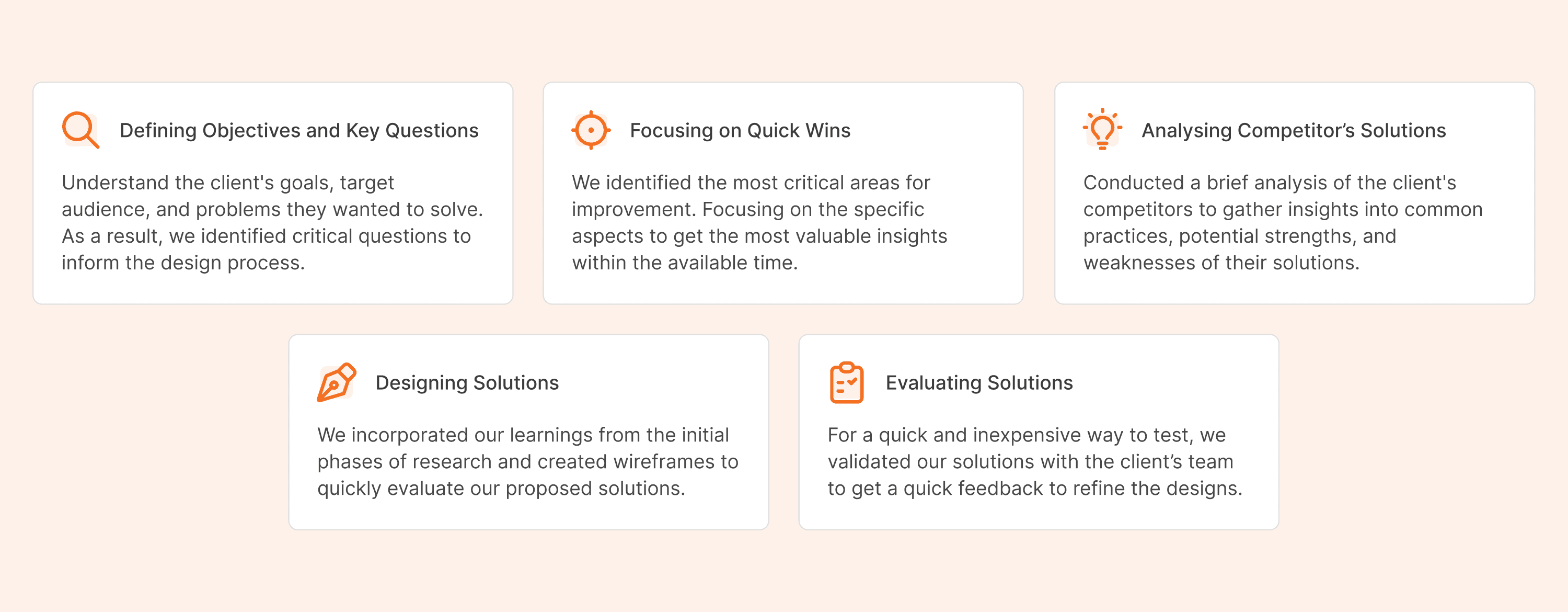
Understanding
We collaborated over several sessions to grasp requirements, the current platform, functional flows, and user interactions.


Competitor Analysis
We conducted thorough research on two major competitors, Mictosoft Power BI and Tableau to gain insights into their features, approaches, strengths, and weaknesses.
Microsoft Power BI
Pros
Ease of Use: The interface is user-friendly, and it’s relatively easy to create dashboards and reports.
Cost-Effective: Power BI offers competitive pricing, with a free version available and lower costs for premium versions compared to some competitors.
Robust Data Handling: Power BI handles large volumes of data efficiently and offers strong data manipulation capabilities.
Cons
Steep Learning Curve for Advanced Features: Advanced features and functionalities can be complex and require significant learning time.
Limited Custom Visualizations: While it offers a range of visualizations, customizing them to specific needs can be less flexible than in some other tools.

Tableau
Pros
User-Friendly Interface: Tableau is known for its intuitive and easy-to-use interface, allowing users to create complex visualizations with minimal effort.
Strong Data Visualization: It offers a wide range of visualization options, making it possible to create detailed and interactive reports.
Speed and Performance: Tableau handles large datasets efficiently, providing quick and responsive visualizations.
Cons
Complexity for Advanced Analytics: While great for visualization, Tableau’s advanced analytics capabilities are not as robust as some competitors.

Design
In the design phase, we made decisions through a combination of stakeholder feedback and iterative refinement. We created wireframes to outline the basic structure and flow, which were then reviewed and adjusted based on input. High-fidelity visual designs were developed, incorporating usability principles and brand guidelines. Each decision was informed by research ensuring the final design was both functional and user-friendly.
Visual Designs
Layout Explorations
User familiarity with other BI tools significantly influenced our redesign. We consolidated major functions into side panes to maximize canvas space and improve usability. These functionalities are organized based on specific user roles:
For Report Designers, Filters and Data Tables were added to the side panes as they are integral to their workflow.
Properties are a common feature across all roles, highlighted in the side panes to provide detailed information about selected components.
By using side panes, we accommodate diverse user roles and leverage their familiarity with similar interfaces, ensuring a seamless and efficient user experience.

We arranged the Filters, Properties & Data Tables in collapsible Side Panes across the platform. We arrived at this decision to improve the usability,
Showcasing the changes in visualisation while performing the edits
Facilitating ease of access to the Data Tables and Properties
Increase visibility of the canvas when needed

Dashboards
Dashboard appearance differed based on user roles. The spotlight was on the Alerts and Schedules cards, keeping business managers and stakeholders informed about business well-being.
Alerts provided data updates and key information on the reports.
Schedules helped users stay updated on the important reports to be shared at the right time.

Connections
Connections are the models where relationship between data tables is define. These connections are later used to create reports.
To combine the data from different data table, relationships and their characteristics are defined.
Properties related to selected elements are listed.

Reports
Once the data connection is selected to design report, users can perform various actions to translate numerical data into stunning visuals.
The actions include, adding Visuals, filters, columns, measures along with other occasional tasks.
Filters allow users to clear out the required set of data and focus on the essential areas of visuals.
Properties pane have similar functionality across the tool.

Conclusion
Throughout the entire UX process, actively involving stakeholders, data experts, and report designers was crucial in ensuring the success of the Phi Data Analytics tool. This collaborative approach allowed us to accurately identify and address the diverse needs of all user roles, resulting in a product that is both intuitive and powerful.
This user-centered design not only improved operational efficiency but also ensured that the tool meets the latest industry standards and user needs. The resulting BI tool delivers valuable insights and supports data-driven decision-making, ultimately driving business success.
Phi Data Analytics now stands out as a comprehensive solution that unifies workflows, enhances productivity, and provides meaningful experiences for all its users.