Keka PSA Project Creation, Edit & Summary
The revamp aimed to address several pain points identified in the existing PSA tool, such as cumbersome project setup, complex editing processes, and a lack of clear project summaries.
Overview
The Problem
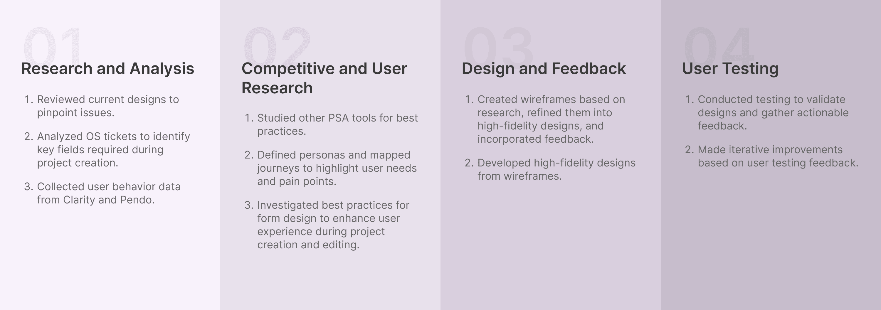
Process
This process was selected to ensure a comprehensive, user-centered approach to solving the identified challenges. By starting with thorough research and analysis, benchmarking against competitors, and iterating based on user feedback, we aimed to create a solution that is both effective and user-friendly.
Research & Analysis
Our main goal during this phase was to establish a clear understanding of existing problems and user behavior to set a solid foundation for improvements.
Current Designs and Problems

User Behaviour (Data from Clarity & Pendo)

Customer Tickets
Competitive & User Research
We then moved on user personas and mapped journeys to highlight needs and challenges. We also studied other PSA tools to identify best practices in project creation and data accessibility.
User Personas
PSA Admin
Responsible for creating numerous project and making sure that basic details are filled to launch a project.
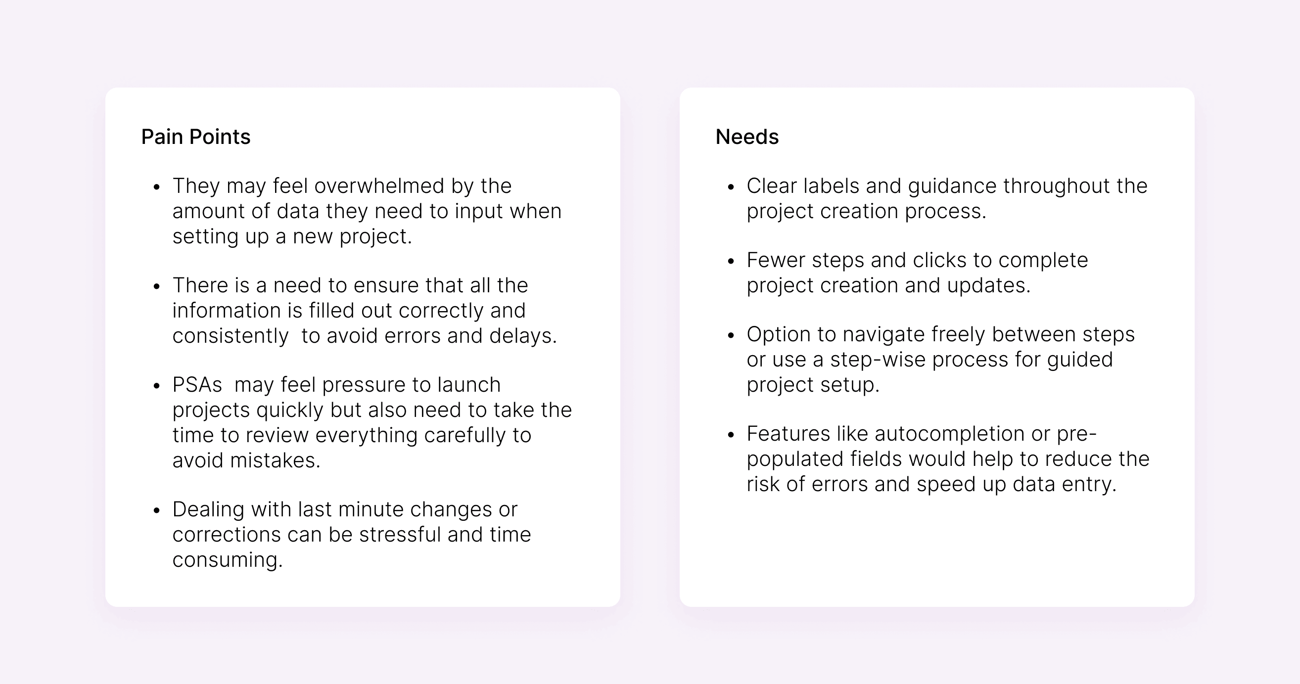
Custom Roles
Responsible for creating projects, editing and ensuring that the project is going well.

Competitor Analysis
Here's a summary of the insights gathered from analyzing the project creation flows in various PSA tools, highlighting the do's and don'ts observed among competitors:
Do's
Consistent fields for settings changes help users recognize and navigate options easily.
Using modals keeps users focused on one task, reducing distractions and improving efficiency.
Reducing cognitive load reduces the risk of accidental actions.
Providing a project overview with links to specific settings improves navigation and quick access to key information.
Don'ts
Presenting all settings at once without categorization can overwhelm and confuse users.
Lack of organized settings leads to inefficient navigation and increased user frustration.
Without confirmation dialogs, users might be unsure if their changes are applied correctly.
Failing to offer a quick overview of project details can hinder users from easily assessing project status.
The absence of a save button leaves users uncertain if their changes are retained, leading to confusion.

Design
In the design phase, we made decisions through a combination of stakeholder feedback and iterative refinement. We created wireframes to outline the basic structure and flow, which were then reviewed and adjusted based on input. High-fidelity visual designs were developed, incorporating usability principles and brand guidelines. Each decision was informed by research ensuring the final design was both functional and user-friendly.
Wireframes

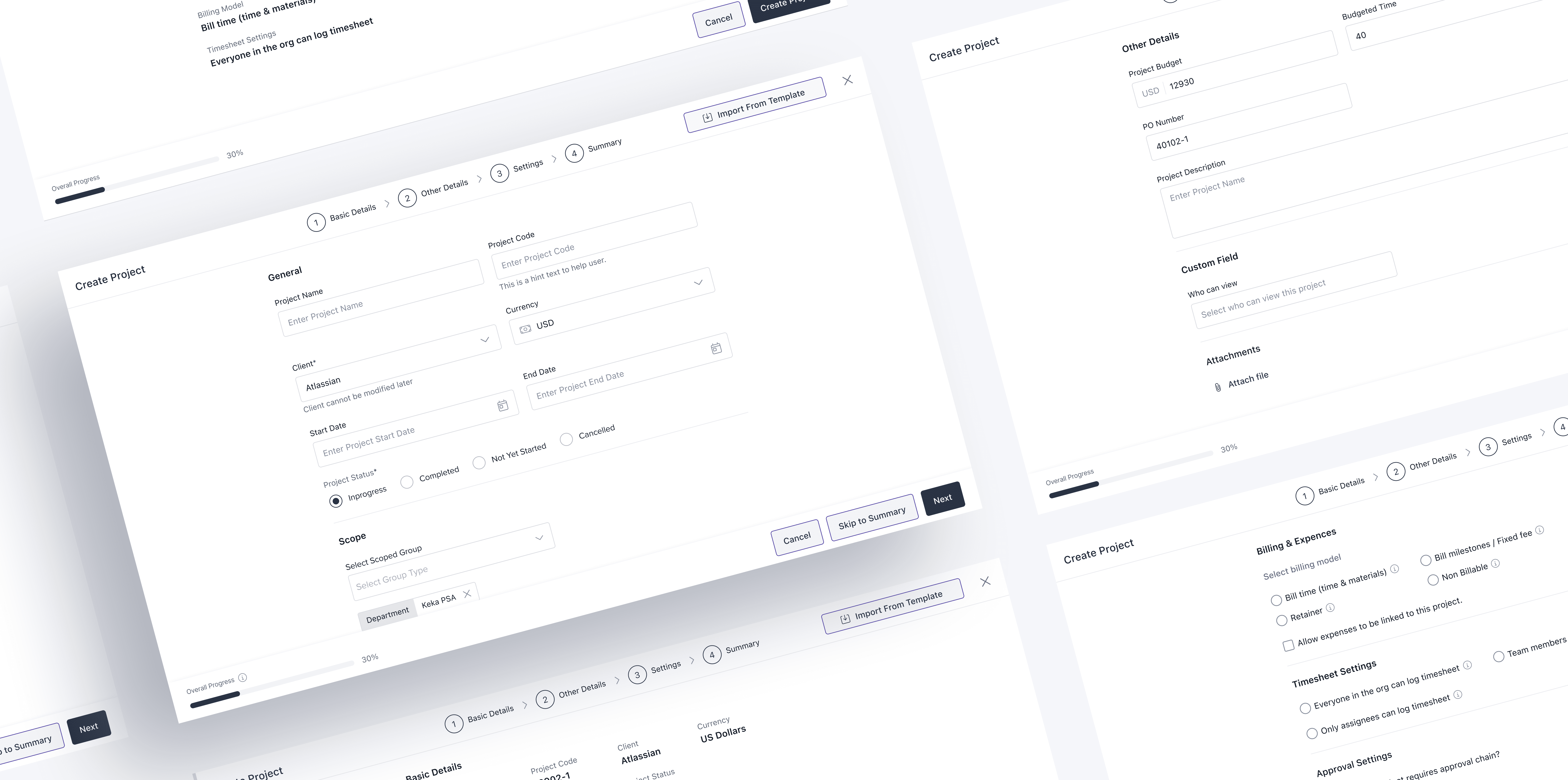
Final Designs
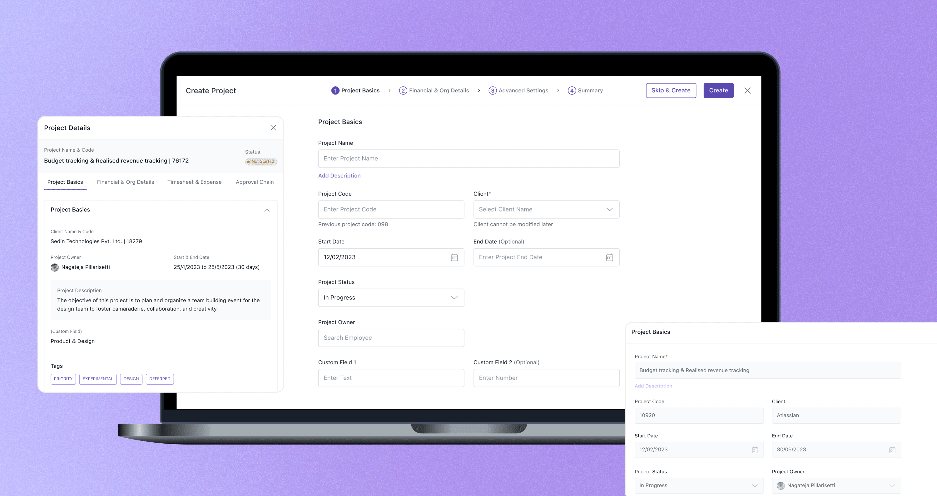
PROJECT CREATION
Full Modal with Step-wise Approach: Helps guide users and reduce cognitive load.
Required Fields: Added based on customer requests to ensure essential information is captured.
Quick Create Option: Allows users to skip steps for faster project creation, satisfying diverse user needs.
Automation and Pre-filled Text: Streamlines the process and reduces manual input.
Help Text: Added to provide guidance and clarify fields where necessary.
PROJECT OVERVIEW
Upfront Display: Important project details are shown when clicking on the project list menu.
Quick Access: Allows users to view multiple project details quickly without navigating inside each project.
SETTINGS
Consistency with Project Creation: All settings can be changed from one place, ensuring consistency and ease of use.
Editability: Designed for easy editing with minimal clicks, enhancing user efficiency.
User Testing
In the user testing phase, we aimed to evaluate the usability and effectiveness of the new design by defining clear instructions, preparing a questionnaire, setting metrics for evaluation, and creating user prompts.
Task 1: Adding a New Project
Objective: Add a new project with specific details and settings in the project list.
Goal: Assess the ease of use and intuitiveness of the project creation process.
Task 2: Viewing and Updating Project Details
Objective: View and update project details in Keka.
Goal: Evaluate how easily users can access and modify project information.
Testing Process
Participants: The tests were conducted with 5 customers and internal team members to ensure a diverse range of feedback.
Execution: Participants were observed as they completed the tasks, with their interactions and feedback recorded for analysis.
Feedback
Streamlined Process: Participants appreciated the streamlined project creation and update process.
Step-by-Step Guidance: The step-wise approach in project creation helped users feel more confident and less overwhelmed, breaking tasks into manageable steps.
Skip Option: The option to skip steps during project creation was valued by experienced users who wanted to speed up the process without compromising on detail.
Increased Clicks for Settings: Some users noted an increase in the number of clicks needed to access settings.
Ease of Finding Settings: Despite the extra clicks, having all settings in one place was seen as a positive change, making it easier to find and make changes.
Timesheet Settings Copy: Some users found the UX copy in timesheet settings difficult to understand, indicating a need for clearer and more intuitive language.
Metrics
4.5
Overall Satisfaction Rate
4.5
Ease of Use
5.0
Intuitiveness
Conclusion
The redesign of the project management features in Keka successfully addressed key user pain points by implementing an intuitive, step-wise project creation process and a comprehensive project overview. This approach streamlined workflows, improved data visibility, and enhanced user satisfaction. By focusing on user needs and aligning with business goals, we achieved a more efficient and user-friendly experience, resulting in increased user adoption and satisfaction. The feedback gathered during testing confirmed that our design decisions met the diverse needs of our users, laying the groundwork for future enhancements.