Iris Central
Iris Central is a an IoT platform which helps in Real Time Crop Management & Data Interpretation.
Overview
Woodpecker Microsystems is a solution provider for healthcare and industrial clients to track inventory and mobile assets. These solutions were then expanded to monitor wireless sensors in agricultural, industrial and environmental domains.
The Problem
Woodpecker Microsystems, Texas
Agri-Tech
Process
The chosen process was to ensure that the final product was user-centered, intuitive, and aligned with business goals. Understanding the company and sector provided necessary context, while competitor analysis identified market gaps and opportunities for differentiation. Ideation and developing a clear information architecture ensured intuitive navigation. Wireframes helped visualize and refine the interface. User testing validated our design decisions and provided crucial feedback. Each step minimized risks and ensured a high-quality, user-centered product.
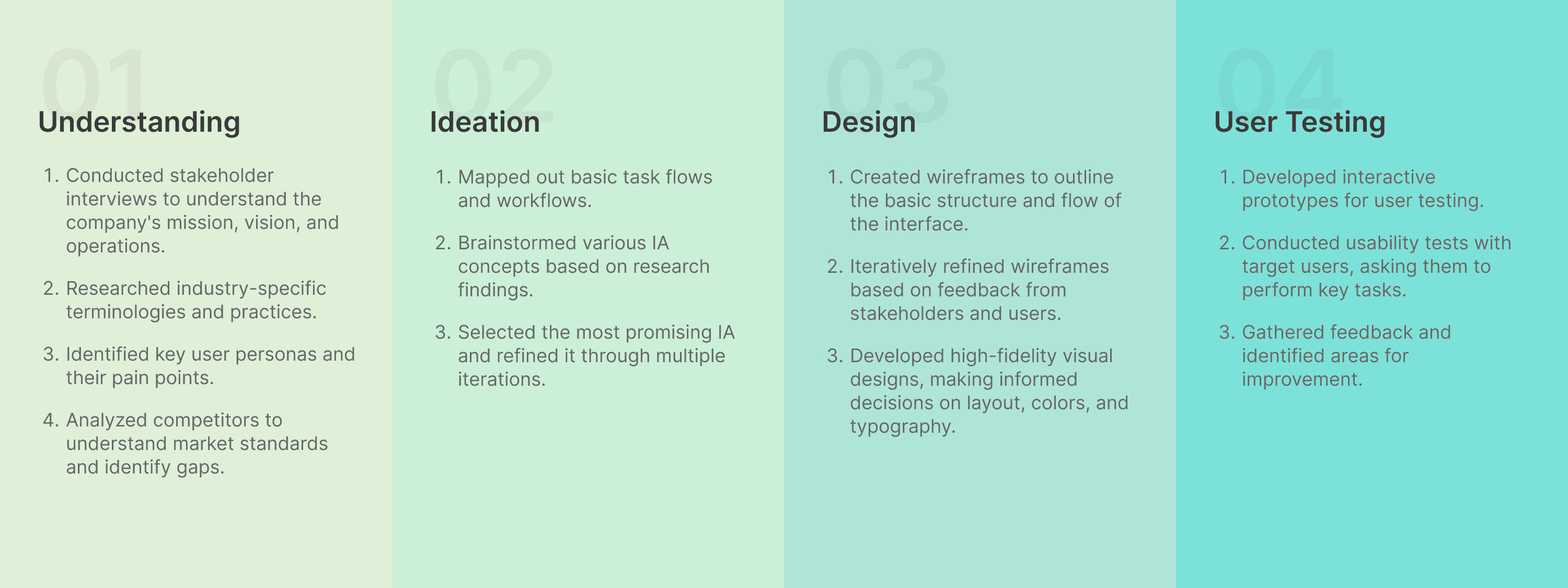
Understanding
We took stakeholder interviews to understand the following :
Company's goals
Explore the stakeholders' current practices and processes for crop management
Understanding their business workflow
Identification of Pain Points
Day to Day tasks that needs to be accomplished
Product Goal
To provide a smart agricultural solution to the farming community with informed and customised solutions based on authentic data
Current Practices and Processes for Crop Management
Stakeholders in crop management prepare soil, select seeds, and use precise planting techniques. They monitor moisture for efficient irrigation and manage pests through scouting and IPM. Nutrient schedules and precision agriculture optimize growth. Harvesting is timely and careful. Data informs decisions, and sustainability practices like conservation tillage and organic farming are used to maintain soil health and reduce environmental impact.
Currently, crop management processes are done manually and require expert knowledge. But what if all of this could be managed remotely? Imagine being able to handle all these tasks from home using advanced technology. This would democratize access to expert-level crop management, making it easier for anyone to optimize crop growth and yield without needing in-depth expertise or physical presence in the field.
Understanding their business workflow

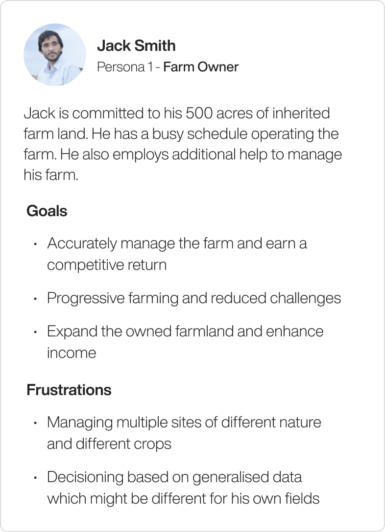
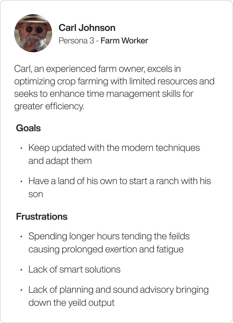
User Personas

Competitor Analysis
We conducted thorough research on competitors to gain insights into their features, approaches, strengths, and weaknesses in the field of crop management technology.
Easy to comprehend
Intuitive, data easy to locate
Interesting information layout
Simple navigation, access to precise tasks
Meaningful recommendations and actionable indicators

Ideation
During the ideation phase, we pinpointed essential user tasks and devised various Information Architecture (IA) frameworks based on thorough research. Our objective was to create intuitive IA structures that streamline user workflows and enhance interaction.
User Tasks
Providing field information, choosing sensors, deploying and configuring the sensors.
Monitoring inputs, taking actions based on the recommendations
Setting thresholds for alerts. Setting Crop and region specific handles
Reconfiguring in case of reallocation of sensors
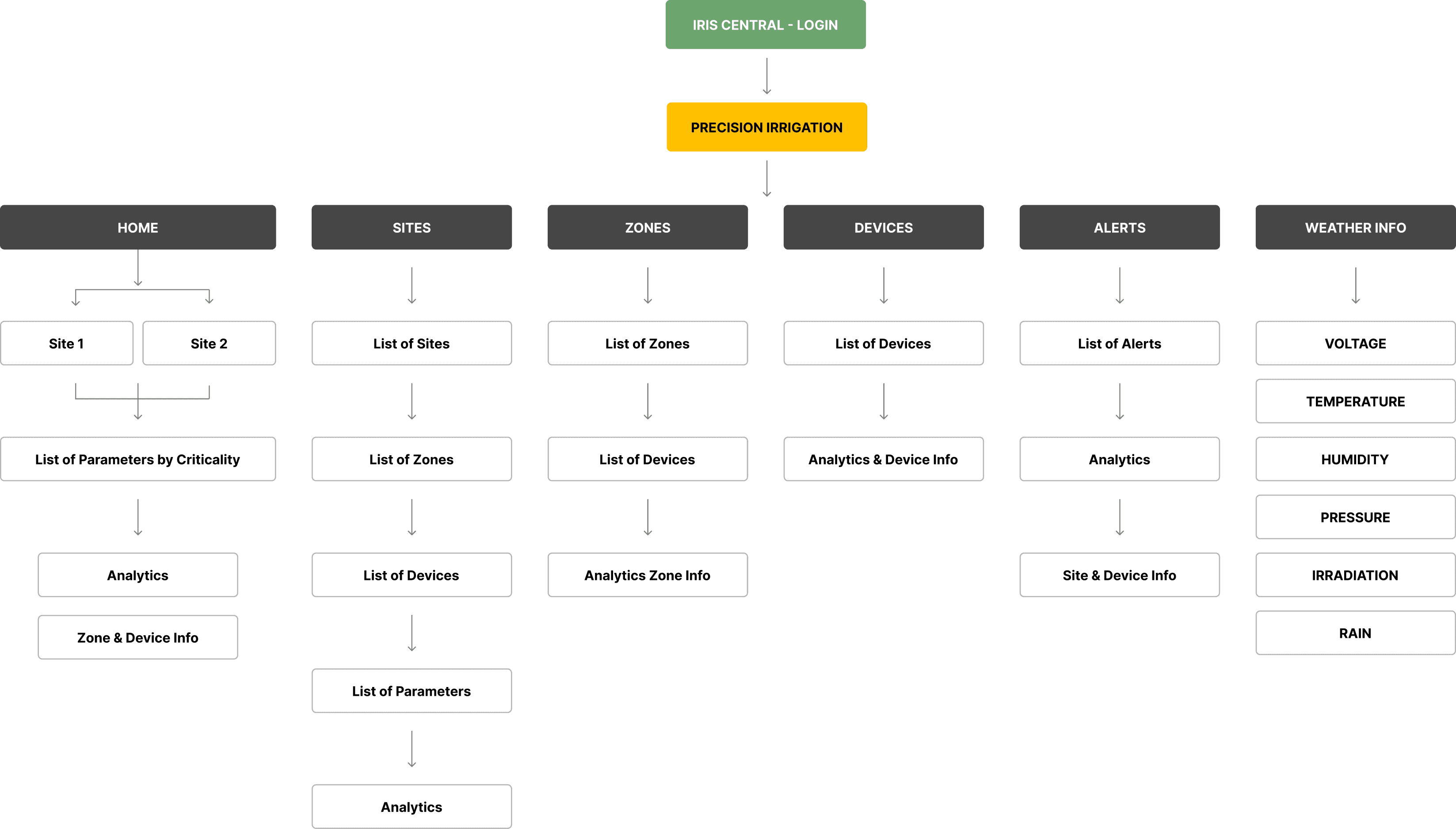
Proposed IA
Brainstormed various IA concepts based on research findings and user needs and explored different ways to organize information to ensure clarity and ease of use. Finalized the IA to ensure it effectively supports user tasks and enhances overall usability.
Design
In the design phase, we made decisions through a combination of stakeholder feedback and iterative refinement. We created wireframes to outline the basic structure and flow, which were then reviewed and adjusted based on input. High-fidelity visual designs were developed, incorporating usability principles and brand guidelines. Each decision was informed by research ensuring the final design was both functional and user-friendly.
Wireframes
Before diving into the designs we did some explorations on the layout and created few the wireframes. We received some feedbacks from the stakeholders:
View only critical information on the dashboard.
Sites should be the centre of attraction.
Allow user to take action on the critical zones and sites.
Allow users can switch between card view and map view making.
Visual representation of the data is most important.


Visual Designs
ONBOARDING : PRE-DEPLOYMENT
Onboarding experience is designed so that the user can have a smooth experience buying a device.
The step-wise process makes it easy for the user to answer few simple questions and the device is suggested accordingly. Also, the proper hierarchy and icons helps is quick decision making.
All the relevant data is also provided so that the user can understand the various data points.
ADDING A SITE
For first time users the dashboard will show no data unless they add site, zone and devices.
For site they need to fill in the basic details and pin the area where the site is located.
Sites can be a huge land area divided into multiple zones.
The design decisions were aimed at providing a smooth experience, ensuring precise site location, reflecting the actual map and geo-tagging, enhancing flexibility and scalability, and offering clear guidance and feedback to users.
ADDING A ZONE AND CROPS
The experience of adding a zone remains same with few extra details about the soil and season.
User needs to select the site in which he wants to add a zone.
User needs to map out the area of the zone and create a zone.
Once they create a zone they can add a particular crop to that zone.
ADDING A DEVICE
When adding a device to a zone, users on a desktop enter device coordinates manually.
On mobile, they scan a QR code and enable location to get coordinates automatically.
After adding site, zone, crop, and device, users can access sensor data easily.
The design ensures ease of use desktop users can manually enter coordinates for precision, while mobile users can quickly scan a QR code and enable location for automatic entry. This streamlined process allows users to effortlessly access sensor data after setup.
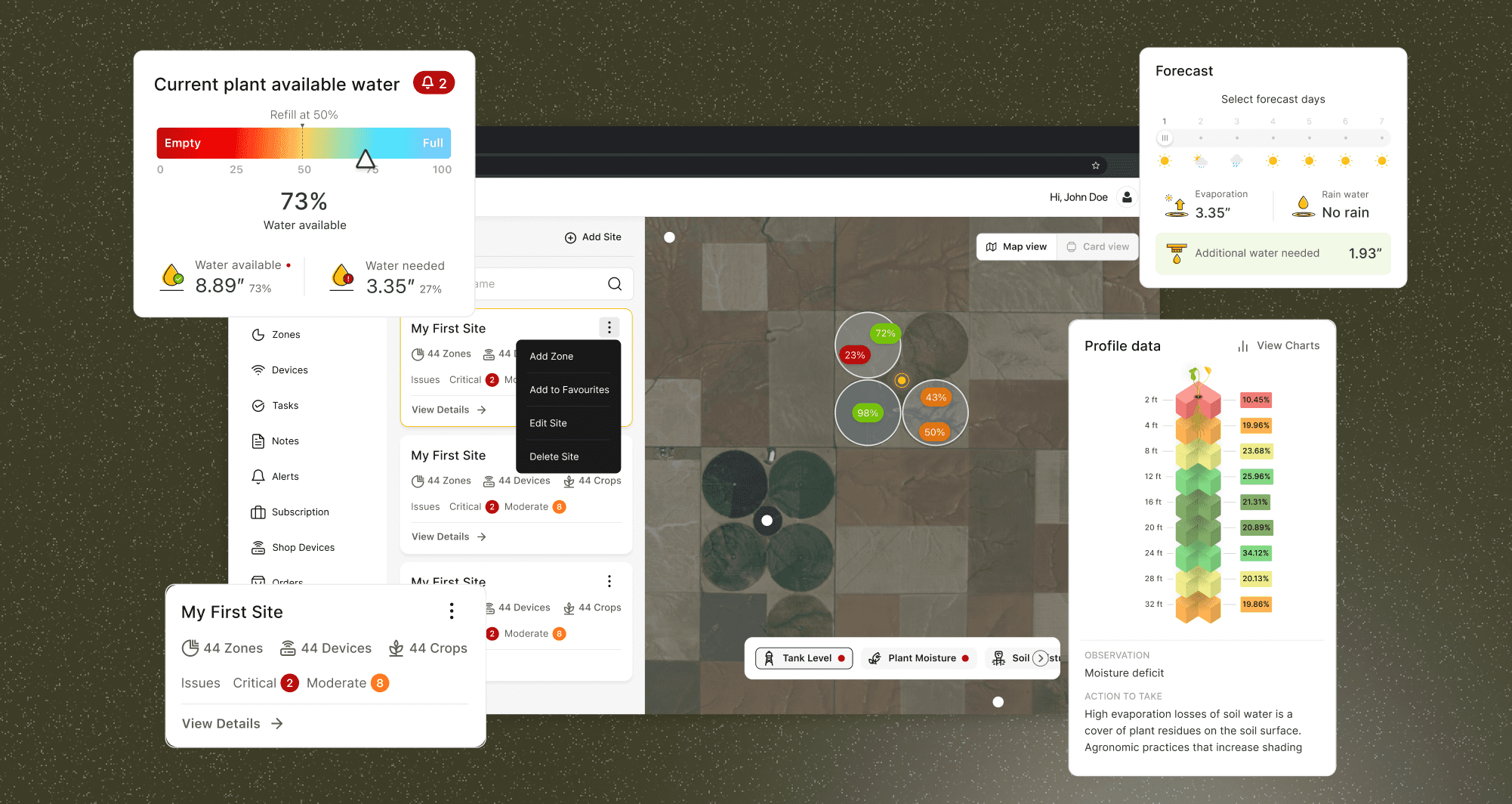
DASHBOARD
The dashboard provides the user full control over sites, zones and devices separately.
The dashboard is crafted to provide users with immediate visibility into sites experiencing issues, alongside a comprehensive weather forecast.
Users can switch between map and card view for sites and zones. In card view, they click parameters to see details.
ZONE DETAILS
Users can click on cards to view details like water levels, charts, and notes. Visual representation makes it easier to understand data.
Mobile Screens

User Testing
Goals: Evaluate the ease of use and intuitiveness of tasks related to viewing details on cards, onboarding for device purchase, and adding zones and crops.
Task 1: Adding a Zone and Crops
Completion Rate: 80% (4/5 users)
Feedback:
5 users found the process straightforward.
2 users suggested more guidance on selecting soil and season details.
Observations:
The site and zone selection process was generally smooth.
Task 2: Onboarding Experience for Buying a Device
Completion Rate: 100% (5/5 users)
Feedback:
4 users appreciated the step-wise process and clear instructions.
1 users felt some icons could be more intuitive.
1 user had difficulty understanding few data points.
Observations:
Most users smoothly navigated through the onboarding process.
A few users experienced minor confusion with certain icons and data points.
Metrics
4.5
Overall Satisfaction Rate
4.2
Ease of Use
4.0
Intuitiveness
4.6
Visual Appeal
90%
Completion of Tasks
Conclusion
This UX case study highlights a methodical approach to creating a user-centered, intuitive product aligned with business goals. By integrating strategic insights and user feedback throughout the process, from initial analysis to iterative design and testing, we ensured a competitive, user-friendly solution.
Navigating a competitive market landscape required thorough research to distinguish our product. Balancing business goals with user needs was crucial, demanding constant refinement through iterative design and feedback. Ensuring stakeholder alignment on user-centered design principles and project objectives added complexity but was essential for success.